March 23rd, 2012
“Fish: a tap essay” is Awesome, Future, Here, Now
Before reading this, go download “Fish: a tap essay”.
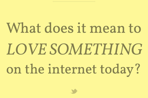
Fish is the brainchild of writer and self-proclaimed-media-inventor Robin Sloan – and it is at once both a great piece of writing about love in an impermanent universe and, says me, indicative of this new thing I am noticing which I’ll call “medium innovation”.
Let me explain. I never studied “media” in any sort of traditional sense and I still can’t figure out where people stand on the Marshall McLuhan assertion that “the medium is the message” (brilliance or bullshit?). But what I do know is that with the abundance of digital consumption platforms comes the opportunity to innovate not only the message but the medium itself. This is *not* a new assertion. What IS new, however, is that people are finally starting to get comfortable with the idea that creating digital media is an opportunity to not only tell a story, but to create a container around it that supports the story. This acceptance has and will lead to some very exciting boundary-pushing over the next few years.
A Tap Essay
Sure, “Fish” works as a blog post. Or a series of tweets. But I don’t think that is really the point.
It’s a short essay (around 1000 words), told through a series of taps. It’s gorgeous and the typography is stunning and the Twitter integration is neat. Something immediately apparent after tapping through a few screens is “why isn’t this a thing?” It then dawned on me that swiping has cemented its position as the more popular digital-page-turning gesture because it mimics the IRL gesture of turning a book page. Yet after tapping through this essay you realize how much more arduous it is to swipe. Was playing around on flipboard a few hours later and the swipe actions felt much heavier.
While I am sure there are a bunch of iPad-native children’s novels that use taps in this way, this is the first time I have seen a story mostly geared toward adults that used the tap instead of the more traditional swipe.
Medium Innovation and Consumption Patters
A quick Google search of Sloan leads to this 2010 article from Wet Asphalt. When describing one of the author’s earlier endeavors, the writer of the article says: “[at] 28,000 words long or a hundred pages…there’s just no market for a work of that length” and then goes on to be shocked that the book raised more than its stated and rather humble goal of $3,500 on Kickstarter: “Shockingly, he raised $13,942 dollars by almost 600 donors, more than most novelists get as an advance on a first novel. Not bad for a self-published, unpublishable novella.”
To a tech person, I mostly found it sort of weird that 28,000 words was “unpublishable” while works of longer and shorter lengths were much more suited for traditional publication. Which lead to this realization: More traditional media containers/mediums were extremely convenient for businesses but not particularly important to consumers.
There’s much evidence to indicate that media consumption is more evolved/advanced than media production. Even Aziz Ansari, $5 comedy special hawker, agrees: “The way people release media is so far behind the way people actually consume it.”
What this app, and it’s solid 5-star average in the app store, proves to me is that consumers have little hesistation to consume something that isn’t in a “traditional” container, so long as it is awesome.
East vs. West
“Fish” was made in San Francisco. While there is plenty of media-related innovation happening here in NYC, I can’t help but wonder if, on the individual artist level, the constant flood of developers and other technical folks in SF has contributed directly to this sort of innovation. Having technical skills in SF is practically an afterthought. Yet among the more media-y people I know here in New York, I still see hesitation around really, really embracing and honing any sort of understanding of technology. Another awesome media innovator I know put it this way: “innovations in media must require technology at this point.” If you want to be a media inventor, you can no longer simply be a storyteller.
There are a bunch of rad people in New York, though, who fit the description well. My favorite among them is OKFocus – a posse of cool people who make awesome futuristic media stuffs. Others that come to mind: StickyBits (RIP), anything David Kraftsow does, and even Emoji Dick. And obvi Kickstarter is going to fund this entire economy/movement (I figure that practically goes without saying at this point).
The End
So the point of this entire ode to “Fish” is that mostly I am really pumped about cool stuff that people are going to invent and produce and create in the name of medium innovation. No one is going to label it that way, I’m sure, but the labeling isn’t really the point. I need to remind myself often that these platforms are so nascent that the most epic stuff really is yet to be invented, and you probably should do the same.
